Apple’s Liquid Glass Design: A Bold Return to Translucency and the Internet’s Mixed Reaction
July 30, 2025
Apple has been at the forefront of innovation and design since the beginning of their existence. Steve Jobs and Jon Ive since the beginning of 1997 had radically altered the previous Apple computer designs
A legacy of Innovation in Apple’s Design Philosophy
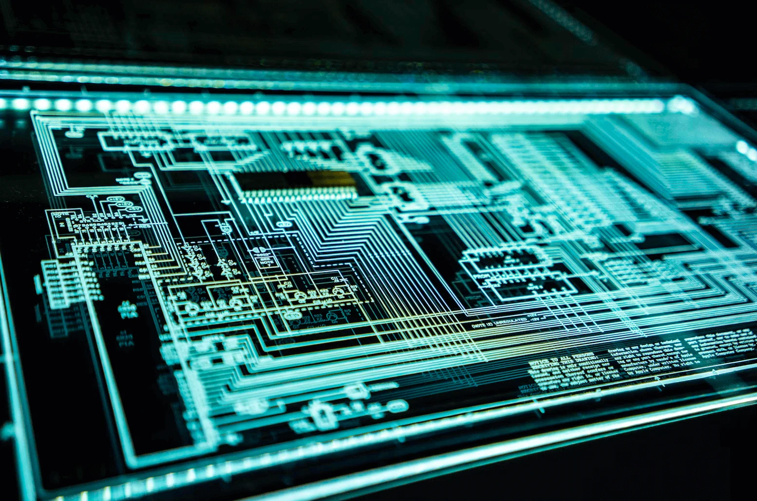
One major turning point in Apple’s design was the Snow White design language, developed by Frog Design, a firm ran by Hartmut Esslinger. Used from 1984 to 1990, it was known for having vertical and horizontal stripes for decoration and ventilation. These stripes would also create the illusion that the computer enclosure was smaller than it actually was. This design boosted Apple’s reputation for sleek, futuristic design and set trends across the computer industry.
Apple’s Design Trend of Translucency
In 1997, Translucency phase entered, with Appl’es release of the eMate. This new look introduced translucent surfaces, inspired by gumdrop candies. Jon Ive and his design team pioneered manufacturing techniques that made these designs possible.
Minimalism, Dark Aluminum, Bold Colors
Over the years, Apple continued to evolve, embracing minimalism, refining with dark aluminum, and experimenting with bold colors. Now it seems we are paying homage back to its translucent roots as Apple attempts to introduce Liquid Glass.
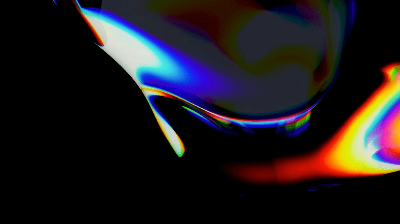
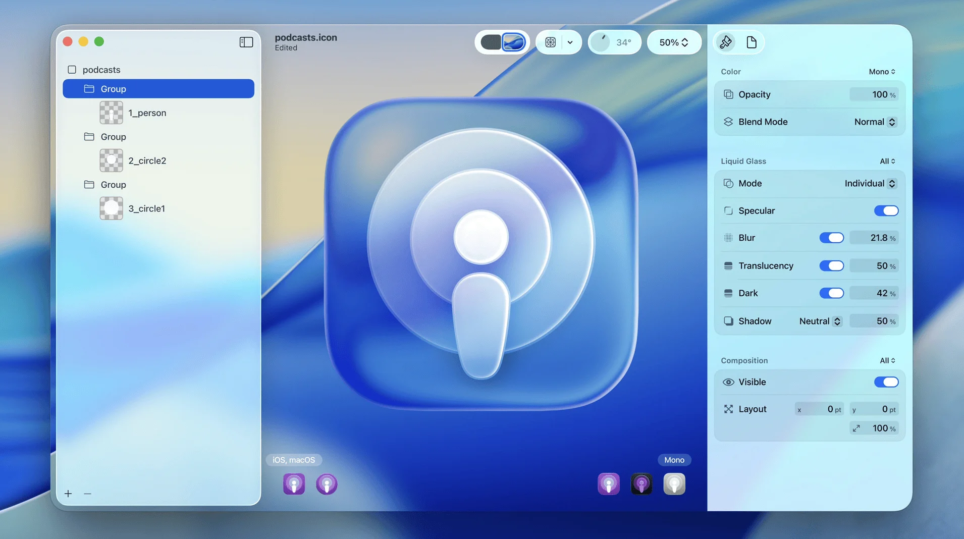
What is Liquid Glass?
Liquid Glass is a type of glassmorphism that mimics the appearance of frosted glass. it uses translucent, blurred elements that create a sense of depth and layering. It is supposed to feel modern while also futuristic.
According to Apple:
“This translucent material reflects and refracts its surroundings, while dynamically transforming to help bring greater focus to content, delivering a new level of vitality across controls, navigation, app icons, widgets, and more. For the very first time, the new design extends across platforms — iOS 26, iPadOS 26, macOS Tahoe 26, watchOS 26, and tvOS 261 — to establish even more harmony while maintaining the distinct qualities that make each unique.”
This new design will be on all platforms: iOS, IPadOS, macOS, watchOS, tvOS. it touts better personalization, easier adoptation, and more intuitive control.
Does Liquid Glass Pass the Accessibility Test?
However, not everyone is convinced.
”I like some of it - icons look fine, some UI details do too. But there are some SERIOUS issues with contrast and accessibility on some basic UI elements like notifications and tabs, and they are visible even on the cherry-picked examples of the keynote!”
Users have drawn comparisons to Microsoft’s Aero design from the Window’s Vista era, with some joking that the pendulum has come full circle; designers once moved away from 3D effects are now embracing them again.
Apple’s Liquid Glass is a bold visual step that attempts to blend modern UI trends with nostalgia. It’s success will largely depend on how well it balances aesthetics and usability. The internet will always have its opinions. Only time will tell if this will become an iconic chapter in Apple’s design history