Mobile-First Design Isn’t An Option, Its A Must In 2025
July 22, 2025
“Google uses the mobile version of a site’s content, crawled with the smartphone agent, for indexing and ranking. This is called Mobile-first indexing”
If you’re still making websites for desktop first and neglecting the mobile end, fix yourself. The year is 2025, mobile-first isn’t a trend, it is the foundation of good web design, SEO strategy, and user experience. Over 60% of your web traffic is coming from mobile devices now. Your website’s performance NEEDS to work on mobile devices. Don’t let people perceive your brand to be slow and sloppy because of your desktop website. Let’s take a look at the facts:
The Stats
- Websites that take too long to load costs companies 2.6 billion dollars each year in lost sales.
- almost half (42%) of users expect average websites to load in less than 2 seconds
- The design of a website has an impact on judgement of credibility by 70%
- 94% of negative feedback about websites was the design
- 75% of all companies will invest in design to get an increase of views and stand out among competitors
- Almost 90% of website users will switch to a competitor after a bad user experience
- Companies that focus on customer experiences receive an 80% increase in revenue.
- publishing 16 blog posts per month instead of 4 makes company websites get 3.5x more visitors
Why Mobile-First Matters Now More Than Ever
If your mobile experience is broken or missing key content, your visibility in search engines will suffer. Now not only are you showing up less on Google, but if a customer does click on your website, they’re going to struggle with your interface.
In less than a second they have decided that your brand is not one they want to do business with. In 2025, you need to have a responsive web design. Imagine giving your competitors customers just because your website isn’t up to date. Users expect fast, intuitive, and touch-friendly experiences. This is so important when a user clicks on your ad and it links to your site.
If your website is taking more than 2 seconds to load, they will leave, likely never to return. The bottom line is, to a customer your website is a reflection of your company.
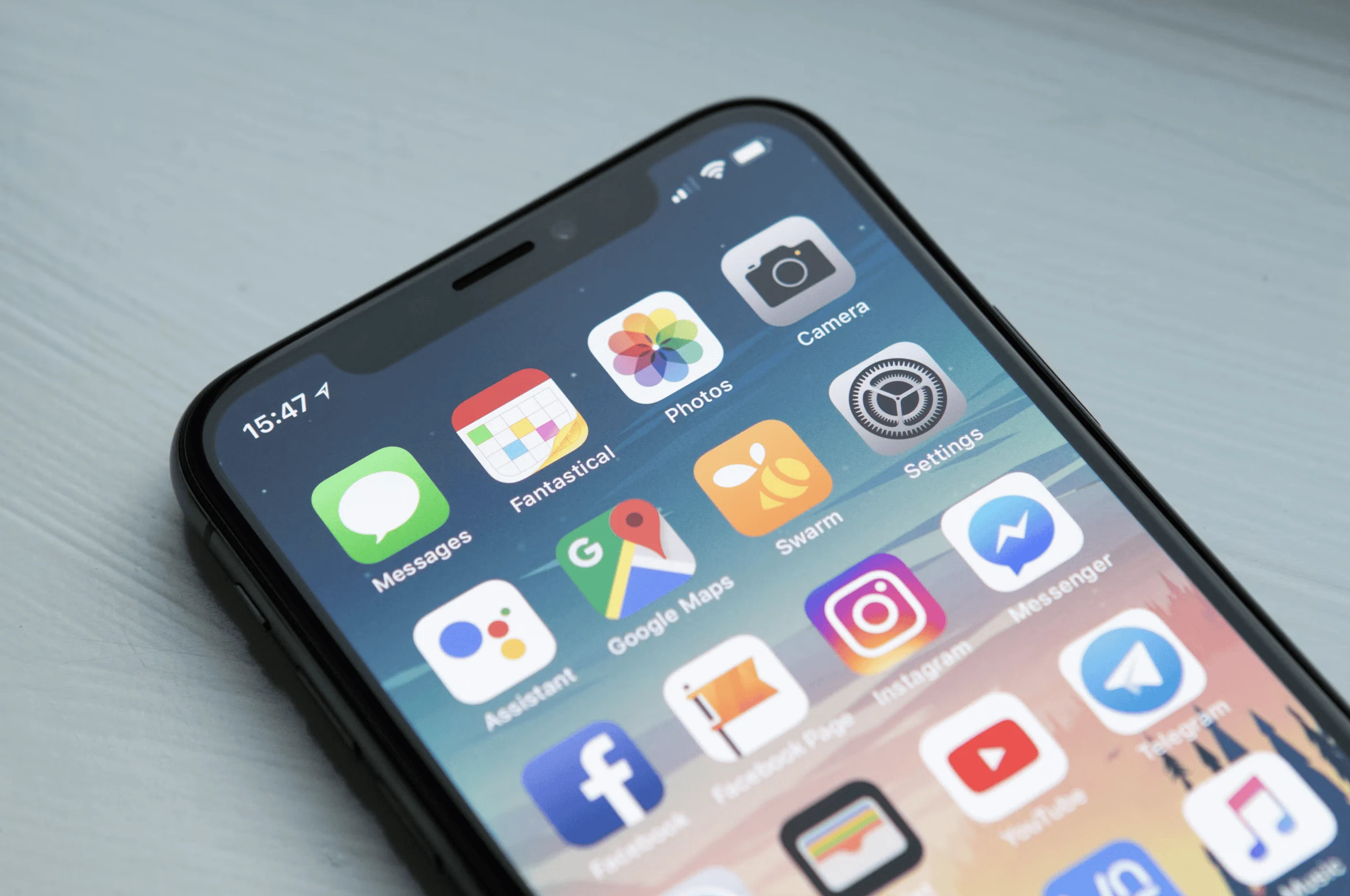
What Does Mobile First Look like?
One of the biggest misconceptions about mobile-first designs is that you are just shrinking your content to fit on a smaller screen. The reality is you need to focus on what matters most. You need to streamline the user’s journey to where they need to go and optimize performance. Here are some of the factors when making a mobile-first design: speed, legibility, touch-friendly, one goal per screen, and scaling.
- Your website should load in less than 2 seconds.
- Your website should be legible on all different mobile screens
- Browsing should be easily achievable on any mobile device.
- Your website should only have one goal per screen.
- Your website should be able to scale up to a desktop.
At Devonus, we begin every project with the smallest screen in mind so you’re not stuck wondering if it will work on only certain sizes. We prioritize performance and clarity across all platforms. We take care of your hosting, SEO optimization and do regular performances reviews to make sure your site doesn’t just look good, it works. We believe that your website is the entry point to your brand, that customers want to come back to engage.